The color wheel and colors – isn’t it just for kids? No, colors are an essential part of our everyday lives. Did you know that we draw conclusions about color in 1/20th of a second (Paris Sherin: Design Elements: Color Fundamentals). And colors aren’t just nice to look at. They have a profoundly functional effect. Therefore, you should also know how to put together and use colors to your advantage in your business communication.
The color wheel
The color wheel can be a valuable tool when choosing colors for your project or theme. So let’s take a closer look at what a color wheel is and what you can use it for.
Itten’s Color Wheel
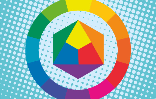
This type of color wheel is called Itten’s Color Wheel. It is named after Johannes Itten, Swiss expressionist painter, designer and teacher. He is closely associated with the Bauhaus school in Weimar (Germany), where he also taught. He is known as one of the great masters of color.
His color circle is simple to understand and to use. It is constructed so that we see the three primary colors in the middle (yellow, red and blue). Next comes the secondary colors that you can mix of the primary colors (yellow + red = orange, red + blue = purple and yellow + blue = green).
At the same time it shows the tertiary colors on the outside of the wheel. Complementary colors are found by drawing a straight line from one’s color to the opposite side of the wheel. Eg. is the opposite color of orange – blue, which is complementary in color.
Related: The logo color reveals your business!
Cold and warm colors
In the color circle the colors are mainly centered on yellow and orange, which are the “warm” colors. In contrast, colors centered around the blue color are seen as “cold”. Picturally, the “cold” colors will step to the back of an image and the “warm” colors will penetrate to the front of the image.
Chromostereopsis
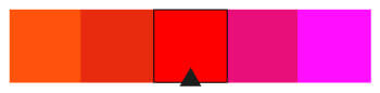
Did you know that red and blue are colors that can be hard to put together in a color theme?
When your graphic designer tell you that the red you have chosen for your theme, does not match the blue or green in your color theme, there may be something about it, as this image from Wikipedia shows very clearly.
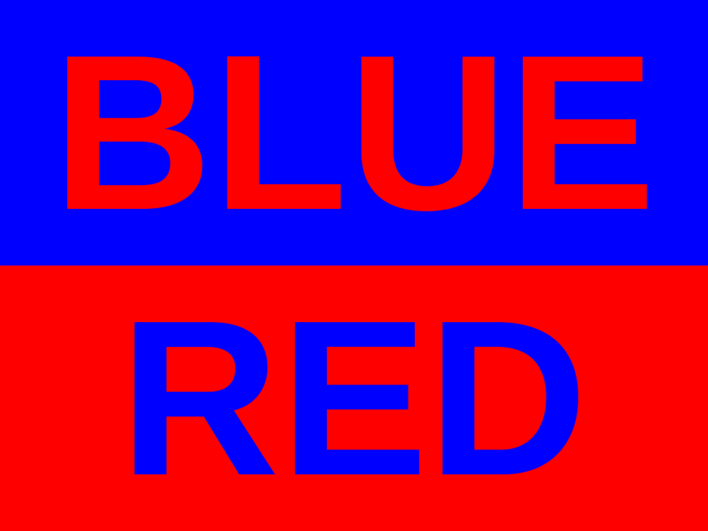
This is because the wavelength of some colors converge (runs together) before others in our eyes. And it makes it difficult for your eyes to discern what is at the front and back of an image. We just determined that the “cold”, blue colors tend to blend in with the background in an image and the “warm” reds appear in front. But with some types of red and blue the colors run together. It almost feel hurtful to the eyes to look at. In fact, the same effect can also be achieved with red and green. Therefore, it may be a good idea to find help with e.g. Adobe, which makes a really good color picker and color themes available for free.
Color themes
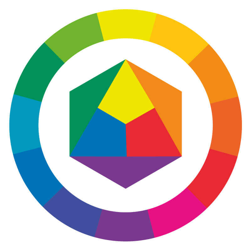
Virtually all color themes are based on the classic color wheel with its 12 color fields. For example, Adobe’s platform has a great tool for creating color themes: https://color.adobe.com/en/create/color-wheel/. I’m reviewing the four most commonly used ways to create color themes here.
Monokromatic color theme
A monochromatic color theme is made from a single color in the color circle – and is built up of different hues and shades based on one color. This type of theme is a safe choice, but often becomes uninteresting to look at.

Analogue theme
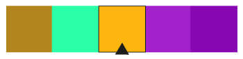
It’s the second most simple theme to create. Again, you should start with the color wheel. And here you simply choose three colors that are next to each other in the wheel. Traditionally, the colors in your theme should be of the same “purity”, color harmony or “chroma level”. But at the same time, you can also add colors made from shades and tints to make the theme more interesting to look at.
Complementary colors from the color wheel
Complementary color themes are created by selecting a primary color from the color wheel – and then adding the color that “faces” it on the opposite side in the color wheel (such as orange and light blue). Here you see e.g. Hulk’s easily recognizable color theme (from Marvel’s Hulk comic book). However, I would recommend that you do not choose red and green (both for the sake of color blindness, lack of contrast and Christmas peace in general). If you want to make a simple color theme according to this pattern, you can just combine eg. two colors – and then expand with tints and shades.
Triadic
Here, 3 colors are used, as the model’s name suggests. Imagine putting a “Merzedes logo” on top of your color wheel. That way you get three colors that are evenly distributed on the color wheel. These types of themes may well be difficult to get nice and cohesive. But it does, on the other hand, provide an “exciting” and quite complex color theme.