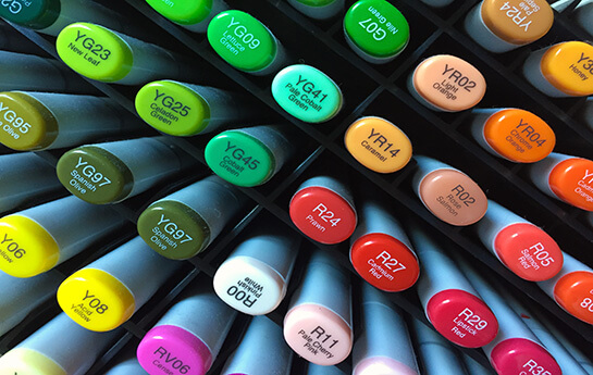
Colors and contrast can be a confusing topic once you start learning about it. How do you actually make a good color theme? Which colors go together? Is there a safe choice? What are primary and secondary colors? And what about complementary colors?
Precisely because it can be a bit confusing, colors are at the same time downgraded in communication contexts. And often the choice of colors for a marketing project or a campaign does not originate from research and with a clear focus on the recipient. Which doesn’t make sense at all.
Colors guide your viewer
But colors are not just for kids! The choice of colors in everything from works of art to visual communication is really something you need to spend time on – and to research closely.
Because the right colors in combination will help your recipient to understand your core messages. Colors and contrasts guide your user or recipient to focus on the right elements of your composition.
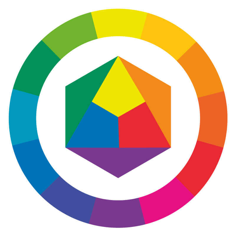
Itten’s color wheel
The complementary colors are part of the well-known color circle, which was developed by the artist and teacher Johannes Itten.
It contains the three pure primary colors inside the center: yellow, blue, and red and their contrasting colors.
The secondary colors in the circle are the colors that can be mixed using the primary colors. In this way, yellow and blue, for example, can be mixed into green. Or yellow and red can be mixed into orange.
The colors on the opposite side of each other are the complementary colors. It is e.g. Orange – Blue, Yellow – Purple or Green – Red.
7 Color Contrasts
There are 7 types of color contrasts that you can use to your advantage – so you create the most harmonious image or work of art.
Contrast of saturation
The contrast of pure colors is the simplest of the seven color contrasts. When colors are used in their “pure” 100% mix, they are vibrant and colorful.
The primary colors yellow, red and blue give the strongest expression of a color’s own contrast. All three colors clearly differ from each other, and the effect is always powerful – and provides the greatest possible contrast.

Warm / cold color contrast
If we look at Itten’s color wheel, it becomes clear that shades of red, orange and yellow are seen as warm. And blue and green colors are seen as cold. In an image, the warm colors will appear in the foreground, and the cold colors will retreat to the back of the image.
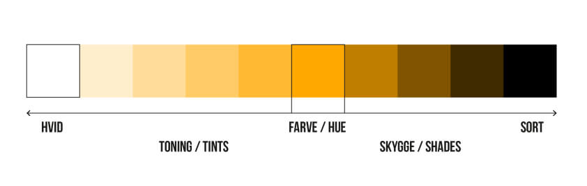
Light / dark color contrast
Light / dark contrast occurs between different colors or the same color in different shades.
It is the contrast between light and dark shades and between black and white that creates the feeling of form.
The contrast between black and white is the most visible light / dark contrast. The light shades appear at the front of an image, while the dark shades recedes to the back of an image.
Quality of contrast
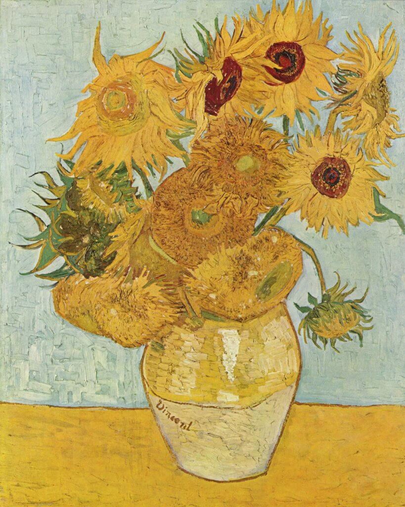
Quality contrast occurs between a pure color versus a muted version of the color (where black or white is mixed in). If you use a pure color in an image, it is drawn forward in the image. Muted colors will fade into the background of an image. Pictured here in one of Van Gogh’s paintings of Sunflowers.
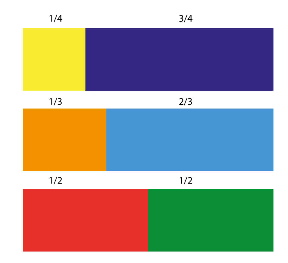
Contrast of Proportion
The contrast of proportion is the aspect ratio of two or more colors that are composed in a composition. Goethe and later Johannes Itten worked a lot with how much of a certain color had to be in an image for it to seem harmonious.
A single yellow element works e.g. strongly on an otherwise violet image. This is because Yellow is much more light-intense than the violet color (which is quite dark) Also the two colors are complementary to each other. Similarly, the orange is more light-intense than the blue. Red and green are equally luminous.
Complementary Colors
These are the colors that face each other in Itten’s color circle. Thus, red is complementary to green. Yellow is the complementary to Purple. Blue is the complementary color to Orange, etc.
Complementary color is the most effective form of contrast you can use between colors. Complementary colors reinforce each other and produce neutral gray if mixed. Our eyes show afterimages in the complementary color. Ie. if you have looked at something green – and then look at a white wall, you will see a red image.
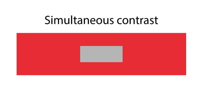
Simultaneous Contrast
The simultaneous contrast is related to the complementary contrast. The simultaneous contrast means that when we look at a particular color, our brain always requires the complementary color of that color too, and so it independently produces the complementary color if it is not present.
The simultaneously evoked complementary color arises as a color sensation in the eye and in the brain and does not exist in reality.
Read more about colors
You can read more here: Colors – learn how to create a color theme
Follow us on Youtube to learn more about colors and color theory – and for us to notify you, when we drop a new episode.